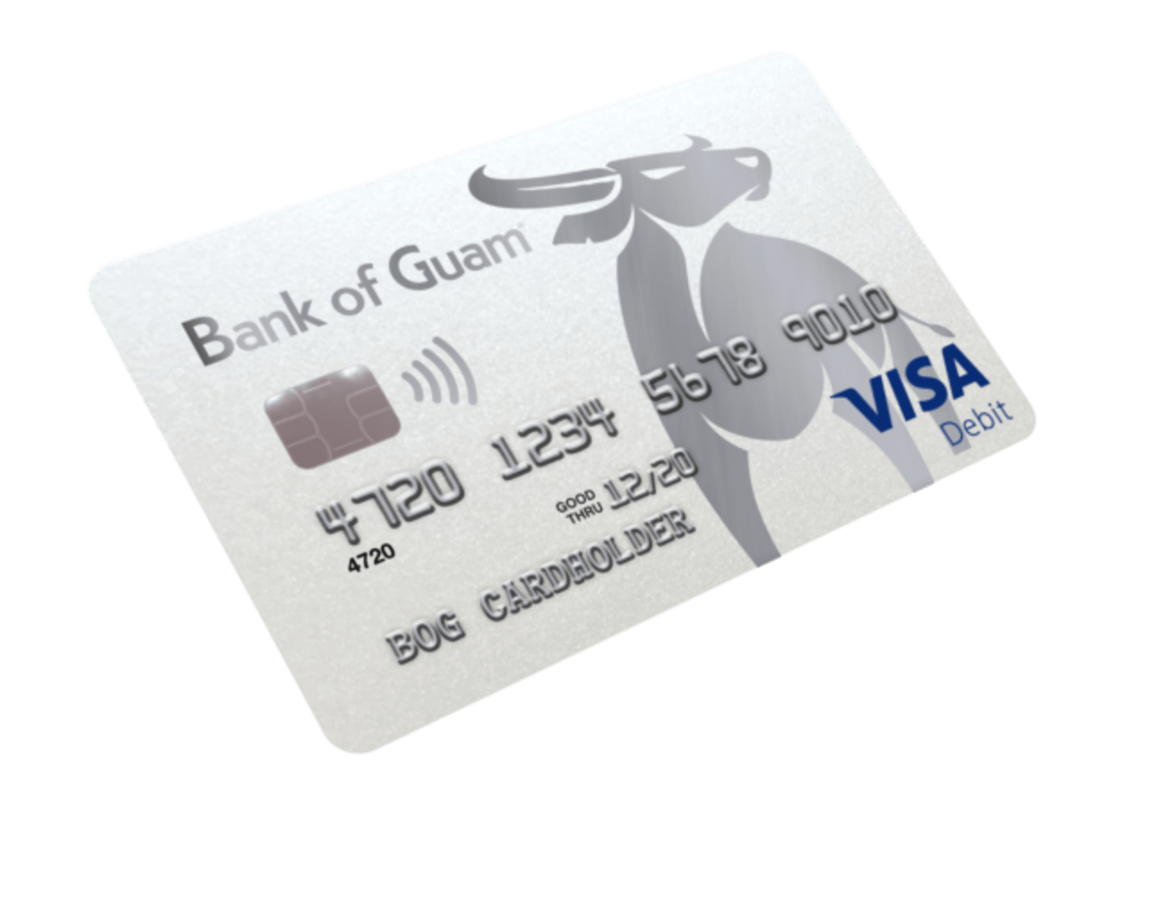
How do you help a small island bank hang with the big boys?
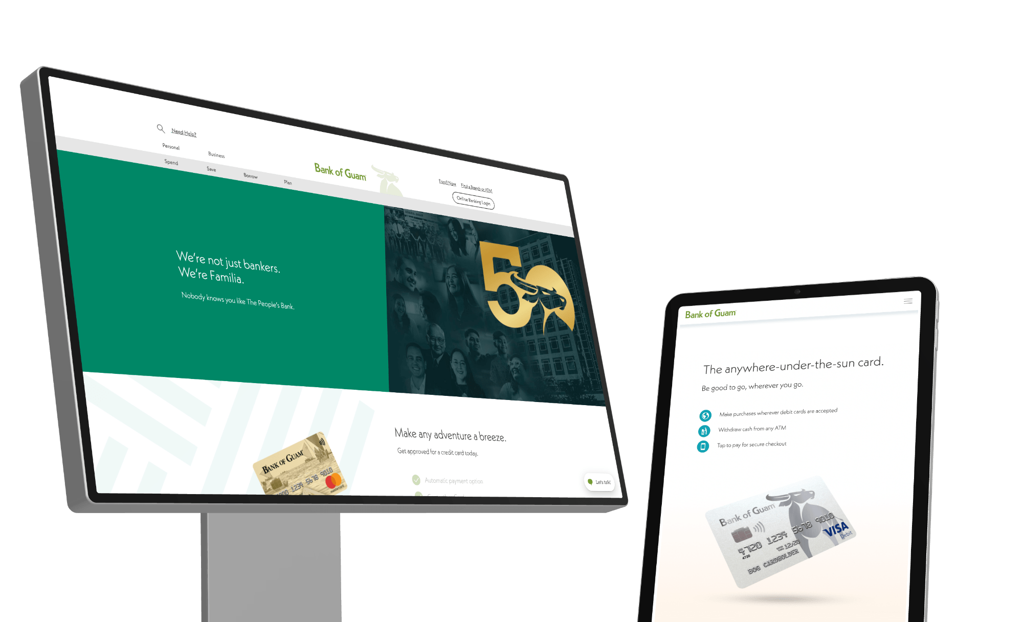
With a 10-year-old website, the Bank of Guam came to the Engine looking for help to build a website that their customers deserve and employees can be proud of.

Go with the flow.
Modernize everything.
The Bank of Guam brings their customers the latest in products and in technology. It was about time their site reflected that. We started with a product audit, which led to discussions around new features that weren't immediately ready, but would be soon. This helped us organize products and plan a flexible site platform that can be updated without extensive budgets or timelines.


We're not just bankers.
We're familia.

Proud to be The People's Bank.

Creating a more tropical user experience.
Warm, mellow and fresh, the Bank of Guam’s color palette gives off instant island vibes.


Speaking to the locals
By focusing on their rich history and personal relationship to the island, we positioned the Bank of Guam as the only place for locals to do their banking.


Capturing the beauty of the island

By using local photography (coordinated across the Pacific in a pandemic), animation, updated art and a new color profile, we were able to bring the charm of the island to life with a brand new site that inspires at every turn.

Making digital waves


“The new site is making such an impression among our different departments it’s prompting them to want to explore what else we can do.”
Jenelle Tanimanglo, Digital Media Manager

“Every time I open the site I am amazed.”
Maria Cooper-Nurse, Vice President/Director of Marketing
More Projects

Fujifilm Sonosite
View case study
LCRA
View case study
Kala
View case study
SOLV Energy
View case study
St. George Spirits
View case study

